Functional Kitchen Design: A Case Study and 11 Useful Tips
Designing your kitchen right the first time can save you lots of trouble (and time!).
A few months ago, we got a call from some empty nesters in SE Portland. They had done a major remodel, including the kitchen, when they moved into the home 12 years ago. It was clear from the start that the kitchen design fell short and now they wanted to fix it. They don’t plan to move any time soon and they want to enjoy their beautiful historic home but this kitchen was making the head chef crazy.
The new design hasn’t been built yet but we will share photos once it has.
We will get to the part about how unfortunate it is to remodel a kitchen that you have already remodeled, but let’s take a look at this kitchen as a case study. After, we will give you the best tips on how to achieve a functional kitchen design the first time around. But first, we will show why this kitchen was so intolerable and how we fixed it.
I have seen some bad kitchens over the years and this wasn’t the worst by any means, but there were some serious obstacles to the cooking flow. The original kitchen was too narrow for an island. The previous designer tried to work around this by putting the island in front of the opening to the breakfast room but that solution created a new set of issues:
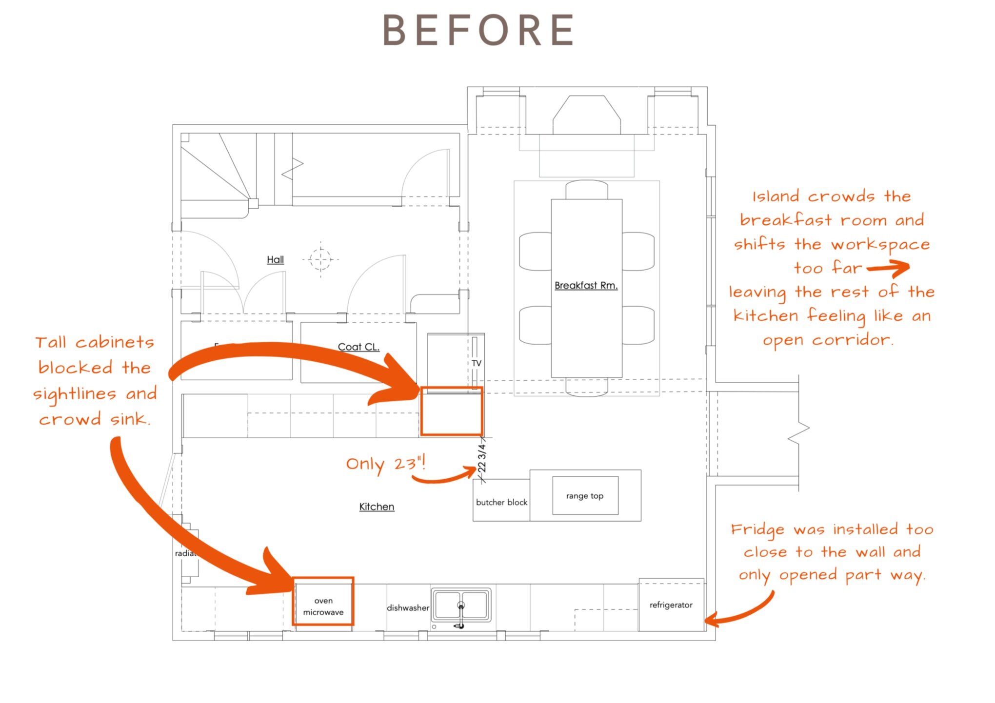
The workspace was crammed into one side of the long room. (Note how tight fridge, sink and cooktop were in the plan.)
The island had to be small and ended up as all cooktop with no workspace.
They tried to amend the lack of countertop by putting a butcher block next to it, but that created a passage by the island that anyone but a child would have to turn sideways to move through and doesn’t offer the expansive workspace you might expect in a kitchen of this size.
The floor plan is out of balance with everything shifted to one side leaving a void in the rest of the room.
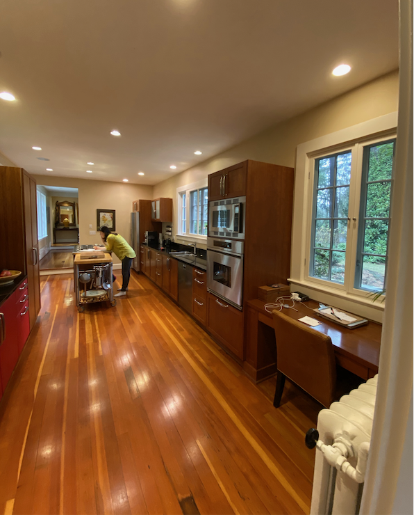
Another issue that isn’t as easy to see in plan-view is the placement of full depth, full height cabinetry that have a tendency to overwhelm any space with their heft. The ovens along the sink wall felt bulky and blocked the sightline to the corner window from almost every vantage point.
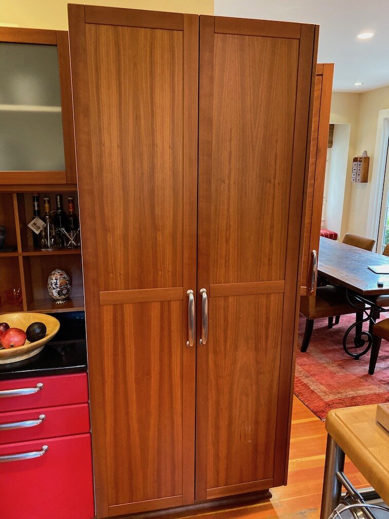
The other tall cabinet, outlined in orange above, cut off the connection between the breakfast room and the kitchen, again by interrupting the sightline. I remember noting that the kitchen felt strangely closed off from the breakfast room, which is right there, during my first meeting with the clients.
They had been living with this for many years and were intimately acquainted with every issue. They also had thought through what they needed and what they were willing to give up but weren’t sure what was possible and what would be sensible from a budget perspective.
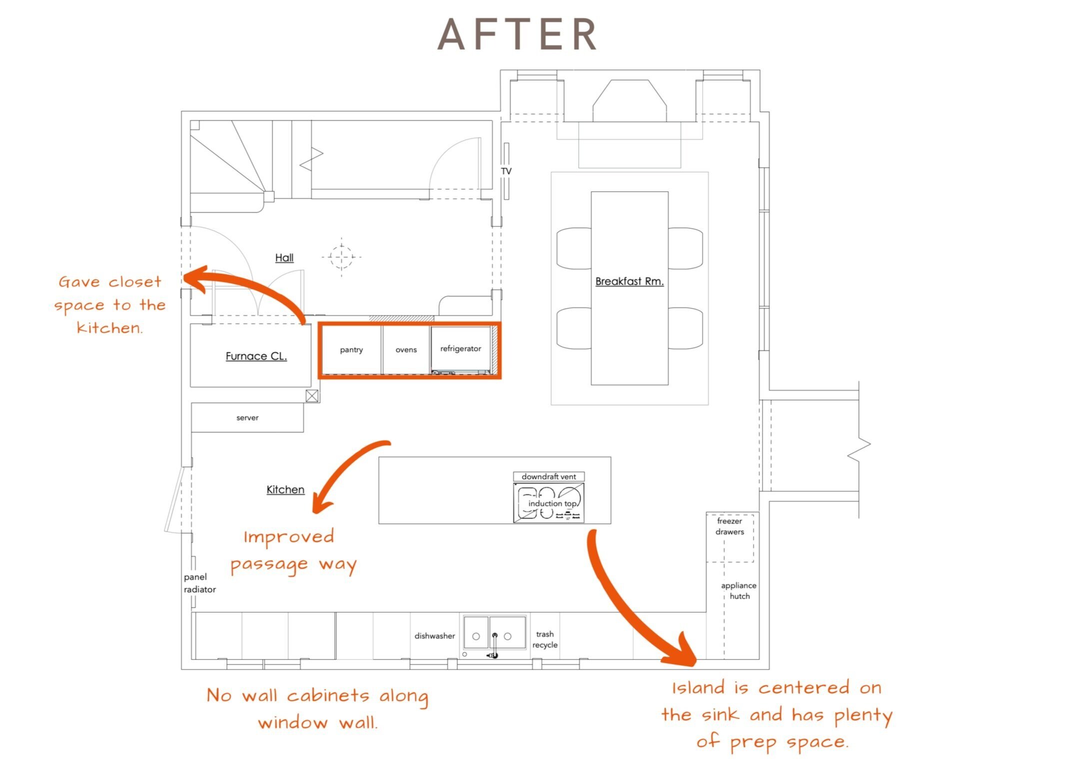
The clients wanted an island but I knew there wasn’t room unless we expanded into adjacent areas. The closets along the center hall offered a possibility of expansion. The clients had already considered this option and agreed at our initial meeting that they would sacrifice the coat closets if it gave them a more beautiful, functional kitchen that was more fitting for their style and home.
We went through a couple of iterations before landing on this plan.
Giving up the closet space to the kitchen opened up a world of possibilities.
The island has grown to just short of 10’ with an open 6’ workspace.
There is plenty of room to move around the island, without any side-stepping.
We still have deep cabinetry along the pantry and fridge wall, but now that it is set further back it doesn’t cut off the view between the kitchen and breakfast room. Notice the cook can be prepping in that big 6’ workspace and chat with friends on a stool by the island, or in the breakfast room. In the original plan, they wouldn’t be able to see around that corner—plus there wasn’t a nice prep space there anyway.
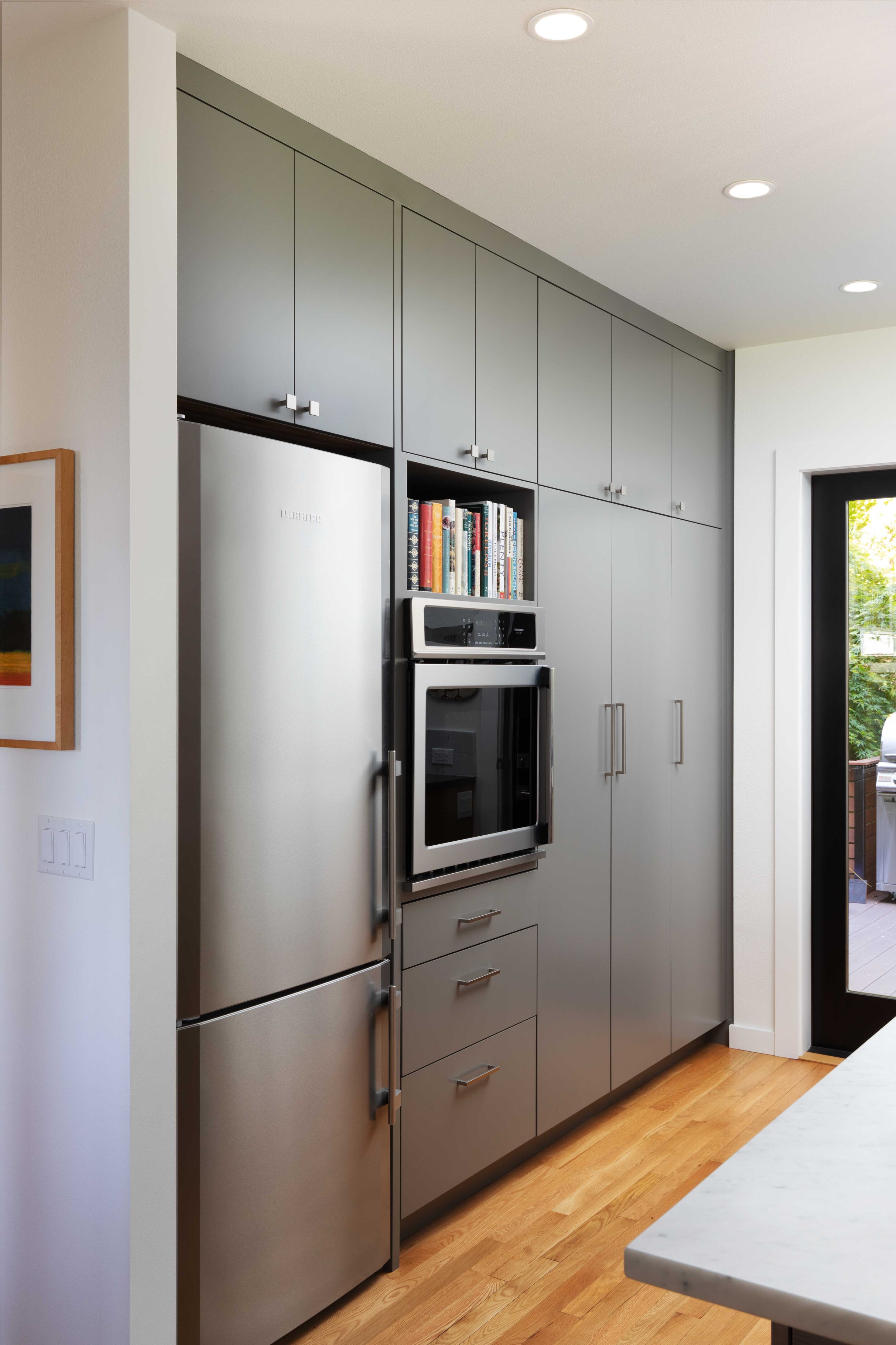
The pantry, oven and fridge wall forms one clean integrated line similar to what we designed for a recent project in the photo on right.
Moving the ovens to the opposite wall opens our view to the corner window, letting in more direct light and leaves the entire window wall without upper cabinets, which was one of our client’s wishes. (We like fewer wall cabinets too. They often look like boxes hanging on walls which isn’t the look we are going for.) We understand storage is a priority in any kitchen, the trick is to integrate it thoughtfully.
Relocating the fridge breaks up the traditional “triangle” rule, which we often ignore. We usually opt to keep the fridge accessible to the workspace, but in a location where kids and guests can get into it without getting into the cook’s way. Moving the fridge also allowed us to wrap the base cabinets around the corner and use that wall to build a tall hutch for tucking away small appliances at counter height. The base cabinet is extra deep at 27” to allow for a little workspace in front of the hutch.
The connection between the kitchen and breakfast room now feels like the open concept it is. The chefs can still join in on conversations and be a part of the party. Most importantly, it allows for mingling without guests actually having to come in the kitchen and get in the way of cooking.
11 Best Tips for Functional Kitchen Design and Layout
Now that the case study has given us an idea of what not to do, let’s take a closer look at what we should do. There are key elements to every design that determines its functionality and overall aesthetic. A well-designed kitchen should be able to check off all the items on this list.
Comfortable Clearance
The only shimmying that should be done in the kitchen is an impromptu dance with a loved one. If you reflexively turn sideways or shrug in your shoulders, then you do not have enough clearance. This feeling of claustrophobia goes a long way in making a kitchen feel impractical. It can be frustrating to work in and suck some of the joy out of cooking.
Ample Workspace
Sometimes, people grow so concerned with storage space that they overlook the workspace. But nothing is more frustrating than trying to prepare a beautiful meal amongst a cluttered mess. The most functional kitchen designs find a balance between workspace and storage space. Ample workspace relies on more than just surface area, though, which brings us to our next point.
Balanced Workspace
Functional kitchen design carefully considers what each workspace will be used for. For instance, a tiny workspace by the stove and a big workspace across the room isn’t functional. The ratio of workspace needs to relate to the function it serves. Kitchen islands are great for all-around function but aren’t always possible in certain floorplans. So, countertops have to be as carefully configured as appliances.
Minimize Upper Cabinets
Modern kitchen design has been moving away from upper cabinets, or at least the overuse of them. Upper cabinets add a lot of aesthetic weight to the kitchen and can make a space feel dark and cramped. Giving up upper cabinets does not necessarily mean giving up storage. Open or floating shelves and other creative storage solutions can add both function and design to wall space.
Thoughtful Storage
Limiting the number of enclosed cabinets means you need to be extra thoughtful about storage. Consider what kitchen tools, small appliances, and dishes can be displayed in open storage, such as floating shelves or hanging solutions. Then, have a clear idea of what each storage space will be used for. Consider cabinet depths, inside shelf heights, and drawers vs. cabinets.
Clear Sightline
The feeling of openness relies heavily on what we can see. Picture yourself standing in each corner of the kitchen. What do you see? Do you see a fridge jutting out? Do you see large cabinets blocking the view into adjoining rooms? Are upper cabinets blocking a window and its lovely view? The farther the eye can see without interruption, the bigger the kitchen will feel.
Natural Light
Natural light is your friend, especially in workspaces like the kitchen, where you need to see what you are doing. A room filled with natural light is always more inviting than a closed-in space that is lit artificially. We love a wall of windows above the kitchen sink. It creates such a nice workspace compared to wall ovens and other cabinets flanking the sink. (We will follow up with a post on how to light a kitchen. After all, natural light won’t carry you through the evening.)
Open Concept, but Not Too Open
It is important to connect the kitchen with the eating area or sitting area so that the cooks can be part of the conversation. However, you want to protect the workspace so that friends and family don’t interrupt the workflow. Guests shouldn’t feel like they have to enter the work area in order to visit.
Smart Fridge Access
In our earlier case study, you’ll notice that we moved the fridge near the breakfast room. This was a mindful kitchen design choice that made the refrigerator not only easy to access from the workspace, but also the breakfast room. Placing a fridge near guest areas or kitchen entrance keeps it accessible for guests without them getting in the way of the cook at the stove or sink.
Ignore the Triangle Rule (Sometimes)
The triangle rule is a good rule of thumb for kitchen design, but it should be more of a consideration than a rule. The main idea behind the triangle rule is the uninterrupted flow between the cooktop, refrigerator, and sink. But sometimes, that is achieved in a less geometrically-restricted way. In many cases, there are a lot of design options that can improve upon the rule, if not break it entirely.
Hire a Kitchen Designer (Not Just a Contractor)
The clients in our case study remodeled their kitchen as part of a more extensive renovation when they first moved into the home. They had a good sense of design and functionality, but they were understandably distracted by the bigger remodel. Needless to say, some functional details fell between the cracks—cracks that weren’t filled by their architect or contractor.
Even if you are working with an architect or contractor, it is worth the time and money to have a kitchen designer review the plan and offer ideas on how to improve it. Kitchens are SO IMPORTANT. If you are spending money to renovate, you need to make sure to do it correctly the first time. Our clients from our case study want you to learn from their mistakes, which is why they were so kind to share their story. Otherwise, you’ll be paying for years to come in dissatisfaction, or in real money to renovate again.
Finding the Best Kitchen Designers
A good designer will do everything possible to create a space that works the way you want to work, reflects you and your taste, and will last for many years. If we ever get a call back to work on a property again, it should be for another room in the home. We recently completed a master suite remodel for someone whose kitchen we did more than ten years ago, and she told me several times during our first project meeting, “We still love our kitchen.” Now that’s the mark of a functional kitchen design that stands the test of time.
View Jenni Leasia’s portfolio for other beautiful kitchen designs. Contact us today for a free consultation.
